Art 3 Final
As an artist I definitely think I am still an experimenter. I don’t think I have found a medium that is my favorite yet, but so far I enjoy pen.
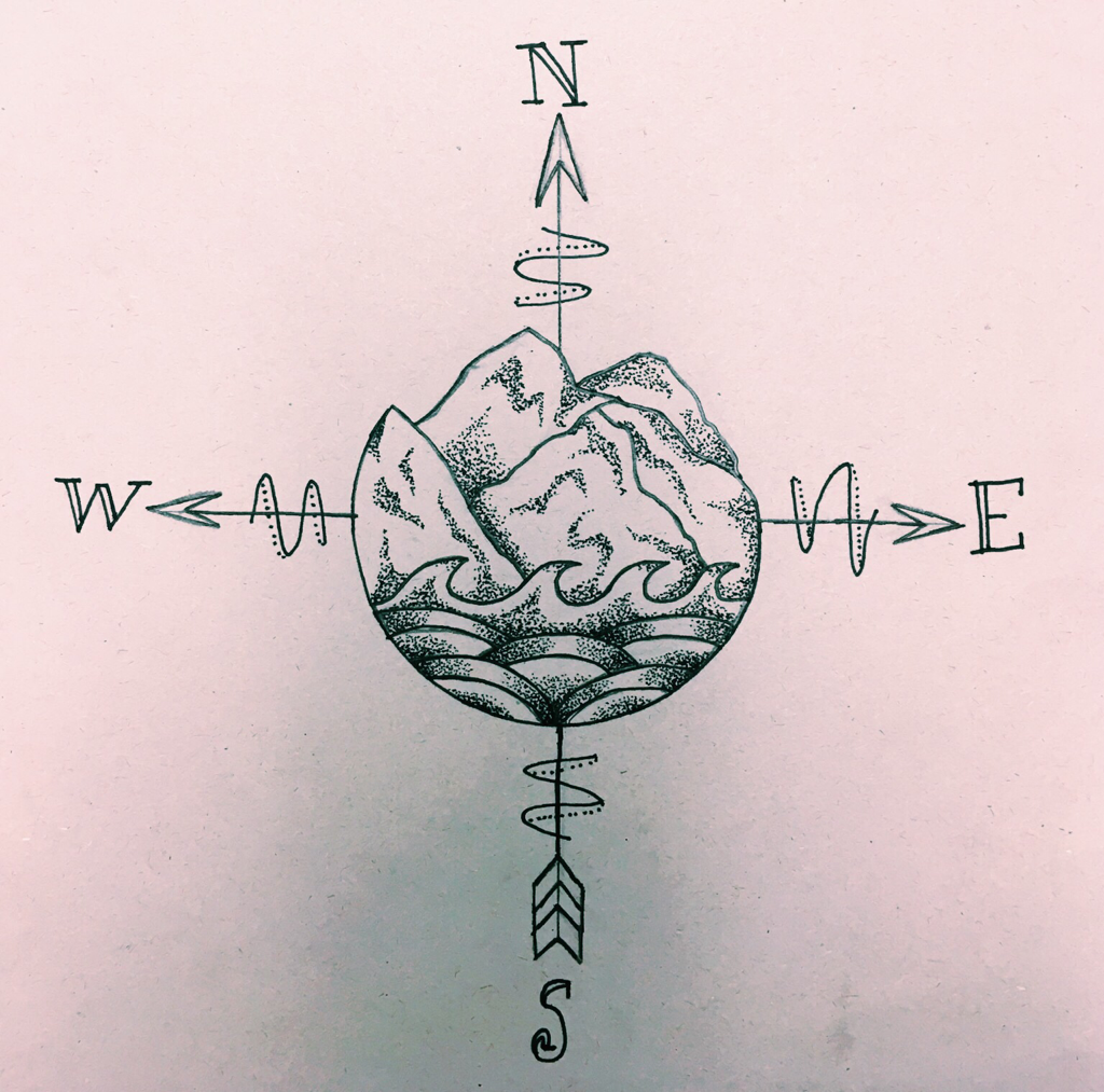
I selected this compass drawing to share because I was proud of my intricate stippling because it was something I’d never attempted before. I also liked this piece because it pulled the central idea of all my pieces together.
I have learned how to plan out my art work better and to not be afraid to try new techniques. A lot of the techniques I was scared to try turned out to be something I actually enjoyed. I think this work shows my growth as an artist in the way that it displays how I have learned to add more detail and in some cases less is more.
Scholastic Art Awards
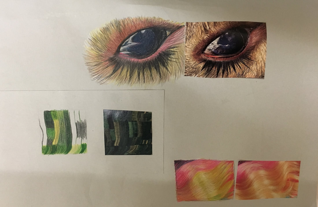
I made this piece because I personally enjoy drawing in colored pencil because I find that I can be a little more precise than I am with paint. I wanted to challenge myself by trying out dimensions so I included that in my piece, and I definitely like how it turned out.
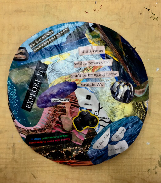
Personal Symbol
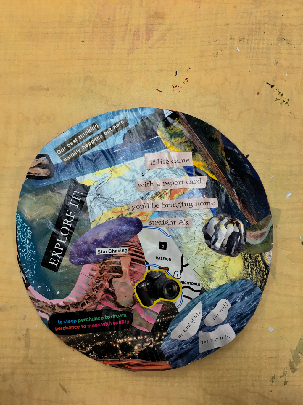
The symbol I chose to represent in my piece was travel. Personally, I hope to travel more in my lifetime and that serves as the allegory to my piece. I chose to do collage because I found it easier to represent the multiple aspects found in travel itself.
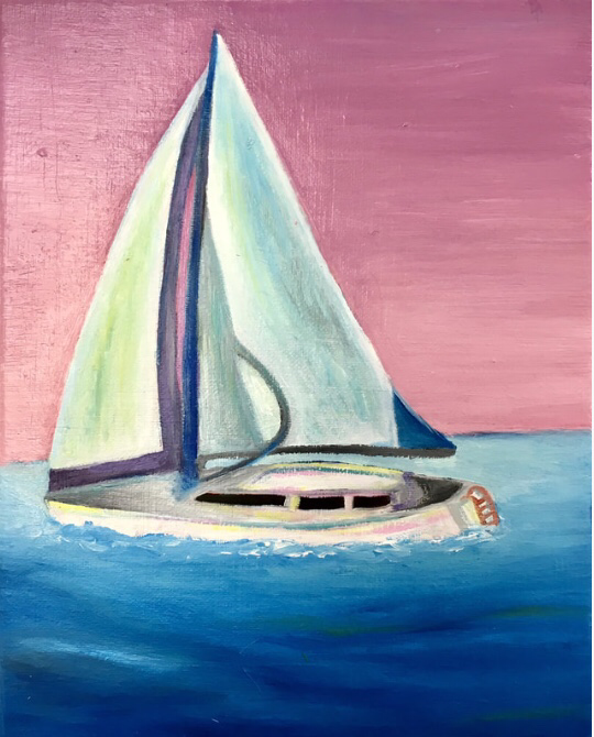
Oil Painting
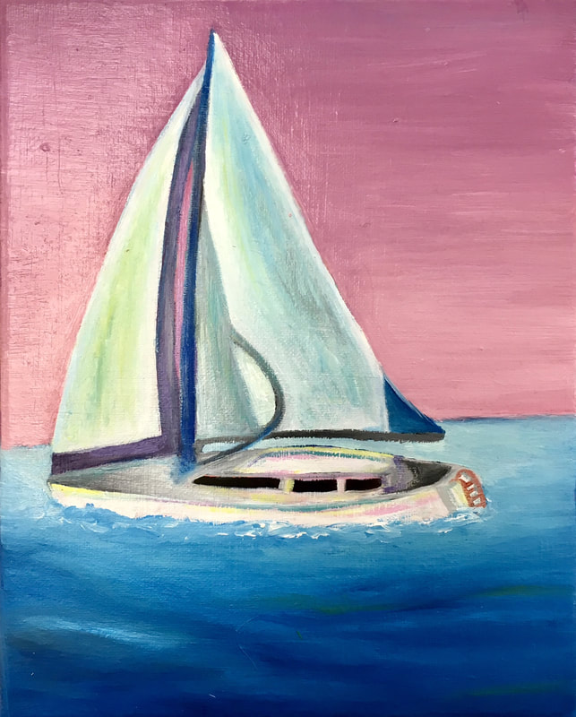
For my piece I decided to attempt painting a realistic sailboat instead of an abstract version. Before I started, I made sure to include and underpainting of red so that that the white and blue oil paint would really pop. At first it was a little difficult to get the right texture in the water and around the boat, but I added more visible brush strokes so that the picture actually came forward off of the background.
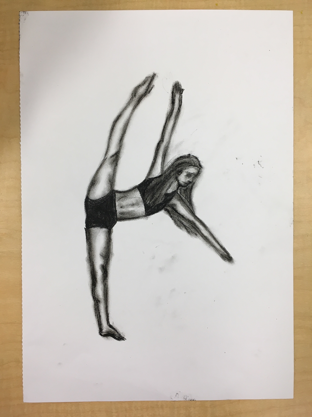
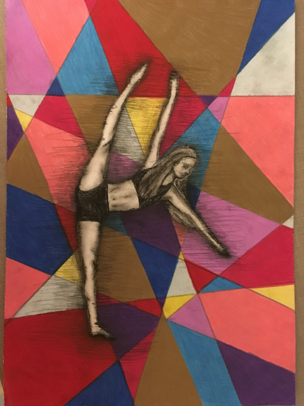
Motion Piece
Artist Statement:
I chose to draw this because I knew it would be challenging to capture the motion of the picture since it is such an usual position to draw someone in. I also have always wanted to draw a portrait of myself dancing, so this unit was the perfect opportunity to do so. I also wanted to make this piece more abstract and colorful since the original photo is in plain black and white, so I made that present in my artwork.
I chose to draw this because I knew it would be challenging to capture the motion of the picture since it is such an usual position to draw someone in. I also have always wanted to draw a portrait of myself dancing, so this unit was the perfect opportunity to do so. I also wanted to make this piece more abstract and colorful since the original photo is in plain black and white, so I made that present in my artwork.
Prisma Piece
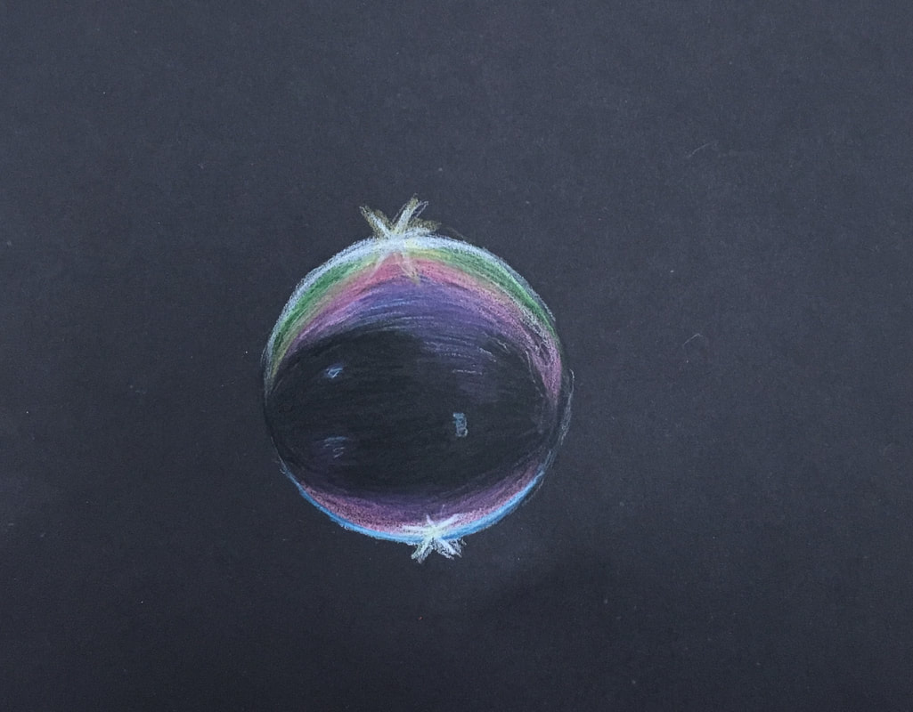
During this exercise I learned a lot about how to highlight and blend. I also realized that a lot of different colors going into a seemingly black color, so instead of just using a plain black prisma, I included blues and dark greens. I struggled a lot with blending the actual prismas, especially the highlights, and making them actually appear "shiny" .
I learned that sometimes lacking detail is not a bad thing in art. Only having ten minutes taught me that I need to prioritize the most important pieces of the art I'm making, and then leave just leave the details until the very end.
This is definitely not my favorite piece because I didn't have enough time to add detail and obviously a background. I don't necessarily like how I did the shadow, but I do like how the highlighting turned out. Through this bootcamp, i learned how to make prismas look opaque, and I improved my burnishing techniques. I also learned how to include highlighting and actually blend it in to make it look somewhat real.
